
Colours are not just an aesthetic choice; they affect our mood, our energy and even our sleep. That is why in architecture the choice of colour should be considered together with the function of the space. Here are the psychological effects of the most commonly used colours and where they can be used at home.
Blue: calm
Blue is a cool colour and in psychology it is thought to have a calming effect. Since it is believed to slow the heart rate and help relaxation, it is recommended for bedrooms, especially for people with sleep problems.
Green: focus and balance
Green is associated with nature. It rests the eyes and is thought to improve concentration, which makes it a suitable colour for studies, homework areas and reading corners.
Pink: the colour that reduces stress
There is research suggesting that pink lowers stress levels. In a much-discussed experiment at a prison in the USA, inmates were observed to behave more calmly in cells painted a particular shade of pink. Some psychologists are known to use pink in their own consulting rooms. Used in powdery shades at home, it adds a soft warmth to bedrooms and relaxation areas.
Red: power and energy
Red is a very dominant colour. Used too much, it has been seen to trigger anxiety, anger and stress. Those who love red should use it on feature walls or in small accent pieces. For a softer effect, terracotta and burgundy shades can be preferred.
White: cleanliness and serenity
White is associated with cleanliness, simplicity and serenity, which is why it is used as the main colour in many homes. To keep an all-white space from looking cold, it needs to be balanced with texture and warm materials.
Grey and black: use with care
Dark grey and black are neutral colours but can feel gloomy when used heavily. Using them throughout living areas is not really recommended; however, in large spaces with plenty of light, in kitchens or on feature surfaces they give very stylish results. We explain ways to liven up grey in our article 5 colours that go with grey.
Frequently asked questions
What is the best colour for a bedroom?
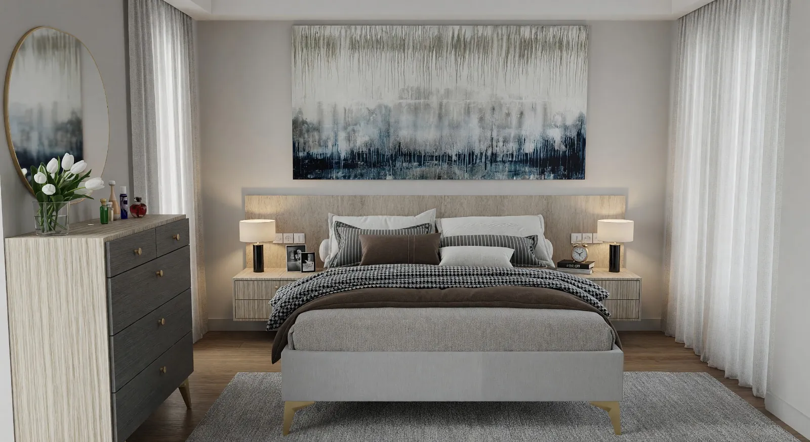
Dusty blue, sage green, powder pink and warm neutrals are the most recommended colours for bedrooms thanks to their restful effect.
Can red be used in a child’s room?
It can be used in small accents; but intense red over a whole wall is not recommended because of its stimulating effect.
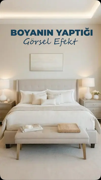
For the effect of colours on how a space is perceived, read our articles colour choice and spatial volume and the visual effect of paint, or get support from our decoration and renovation service.