
The biggest mistake when choosing colours is thinking about each surface separately. Yet colour is one of the most powerful tools for managing the volume, light and perception of a space. Walls, floor, furniture and textiles are read together; when one is chosen in isolation from the others, the space looks fragmented and small. Here are five rules to make a space look larger and more balanced.
1. Reduce contrast
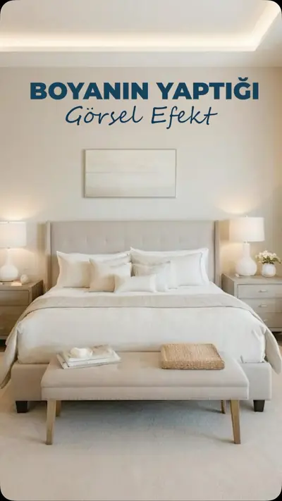
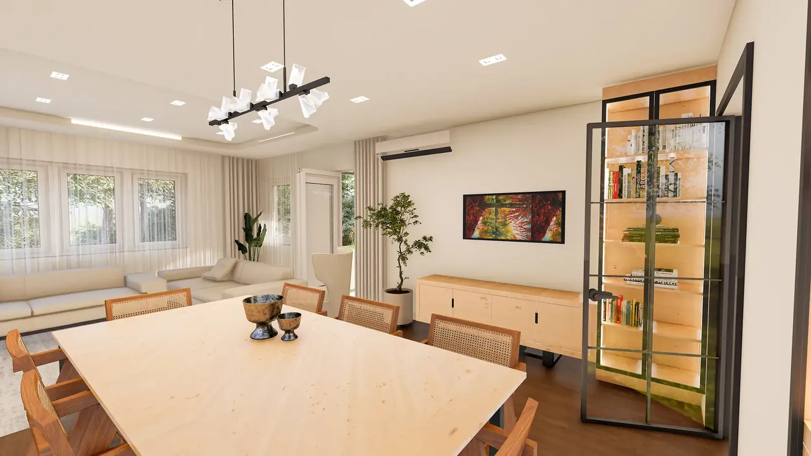
The basic logic for making a space look bigger is this: the lower the contrast, the more unified the space appears. When walls, floor and large furniture are in similar tones, the eye does not get caught between surfaces; boundaries soften and the room is perceived as larger than it is.
2. Light base, dark accents
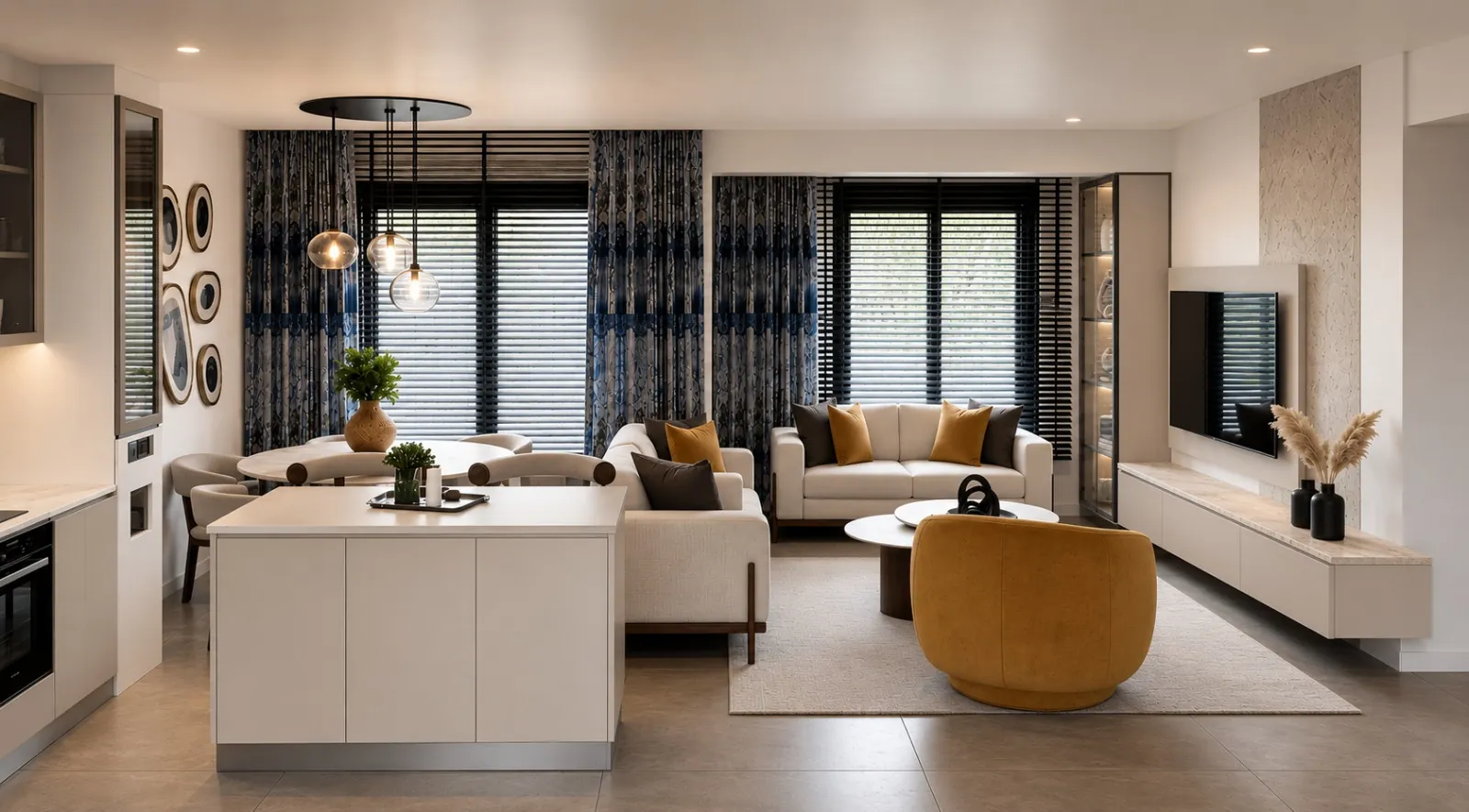
If you want a stronger effect, use dark accents on a light base. Light floors and walls preserve the sense of space, while a dark coffee table, lamp or frame adds character. That way the space stays airy without looking dull.
3. Don’t leave cool tones on their own
Used alone, cool tones such as grey and blue can make a space look cold and sterile. Balance them with warm colours such as wood or beige. A grey sofa looks far more liveable alongside a wooden coffee table and a linen curtain. For colours that go with grey, see our article 5 colours that combine with grey.
4. Concentrate dark colour on a single surface
Concentrating a dark colour on one surface gives a better result than scattering it in small doses. A dark wall, a TV unit or a bookcase adds depth to a space; but repeating the same colour on five different small objects creates a sense of clutter. We showed how dark paint changes the perception of a space in our article the visual effect of paint.
5. Work with shades of the same colour
Rather than mixing different colours, working with light and dark shades of the same colour is much more balanced. For example, a beige wall, a sand-coloured sofa and cushions in brown tones are different from one another, but because they belong to the same family they create a sophisticated unity in the space.
In short
- Think about the walls, floor and large furniture together.
- Reduce contrast and use accents in a controlled way.
- Balance cool tones with warm textures.
- Concentrate dark colour on a single surface.
- Work with shades of one colour instead of different colours.
Frequently asked questions
Can a dark colour be used in a small room?
It can, but on a single surface and in a well-lit room. Painting the whole room dark makes the space feel cramped.
Should I paint the ceiling the same colour as the walls?
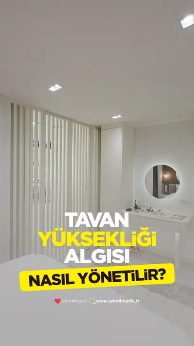
Painting the ceiling one shade lighter than the walls increases the sense of height. The same shade gives a sense of unity; in rooms with low ceilings we recommend a lighter ceiling.
For professional support in choosing colours, textures and materials, take a look at our decoration and renovation service.