
If you want a calm, airy and timeless home, colour pairs built on soft tones are the safest place to start. The four combinations we shared in our short video can easily be applied in both modern and classic spaces.
1. Soft mink & beige
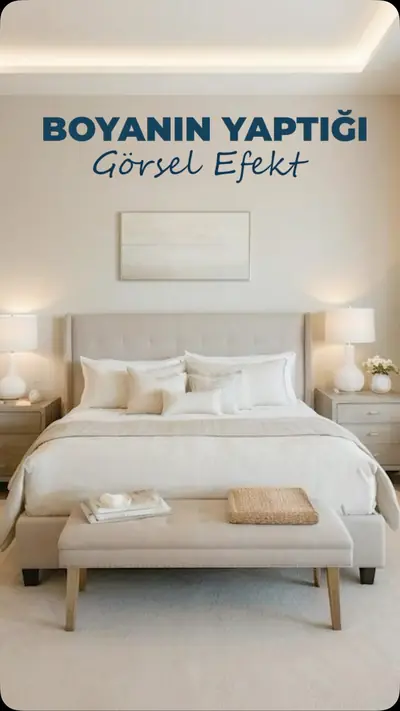
Warm, sophisticated and versatile. Mink tones add depth to beige, and together the two colours give the space a velvety warmth. Ideal for living rooms and bedrooms; works very well with walnut wood and brass details.
2. Dusty blue & cream
A soothing, airy pair. Combined with cream, dusty blue gives the space a light sense of coolness and openness. Especially successful in bedrooms, children’s rooms and bathrooms. We described the calming effect of blue in our article on colour psychology.
3. Powder pink & beige
Romantic but understated. Balanced with beige, powder pink loses its “sweet” look and gains an elegant warmth. A lovely choice for a bedroom, dressing room or reading corner.
4. Sage green & cream
Natural and restful. Together with cream, sage green brings a breath of nature into the space. Its effect is very strong on kitchen cabinets, headboards or a single wall.
How should these colours be applied?
As a general rule, the light tone (beige or cream) can be used on walls and large surfaces, and the second colour on furniture, textiles or an accent wall. If you’re curious about how colours affect the volume of a space, read our article on colour choice and spatial volume, and for bolder pairings, 5 colours that go with grey.
Frequently asked questions
Do pastel colours make small rooms look bigger?
Light, soft tones reflect more light, so they usually make small rooms feel more spacious.
Which pairing should I choose for a north-facing room?
In rooms that get little light, combinations with warm undertones (mink & beige, pink & beige) work better; cool blues can look greyish in these rooms.
To create your colour palette together, take a look at our decoration & renovation service.